National Gallery of Modern Art (NGMA)
Entering the lively National Gallery of Modern Art (NGMA) in Bangalore, India, you're greeted by a wide variety of artistic works and cultural stories. However, when it comes to exploring their website, visitors often face difficulties that make it hard to easily navigate and interact with the museum's rich collection and important resources.

Industry:
Heritage & Entertainment
Category:
UX & Content design
My Role:
Himani Kumawat and I collaboratively undertook every aspect of the UX/UI project, seamlessly merging our skills to design, prototype, and iterate, ensuring a holistic and cohesive user experience.
Defining the Problem
The current NGMA Bangalore website presents a significant barrier to user engagement and exploration of the museum's offerings. This hinders the museum's ability to connect with its audience and fulfill its educational and cultural mission.
01
Research
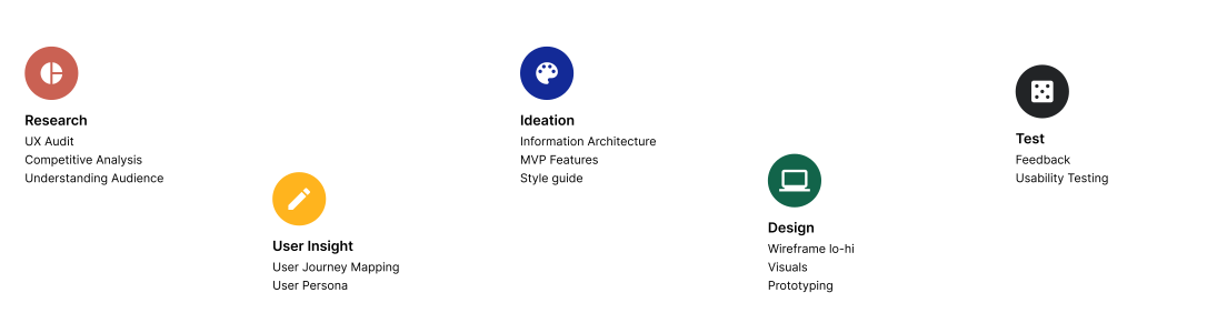
Process
Project Planning & Organising
Phase 1
Phase 2
Phase 3
Phase 4
Phase 5
Lack of accessibility
The website is not fully accessible to users with disabilities, potentially excluding a significant portion of the audience.
Limited content engagement
Static text-heavy content with minimal interactive elements fails to engage users and provide a dynamic experience, potentially discouraging exploration and deeper learning.
Key Problems from UX Audit
Outdated design and navigation
The website's cluttered layout and outdated aesthetics feel dated and unintuitive, making it difficult for users to find desired information and navigate seamlessly.
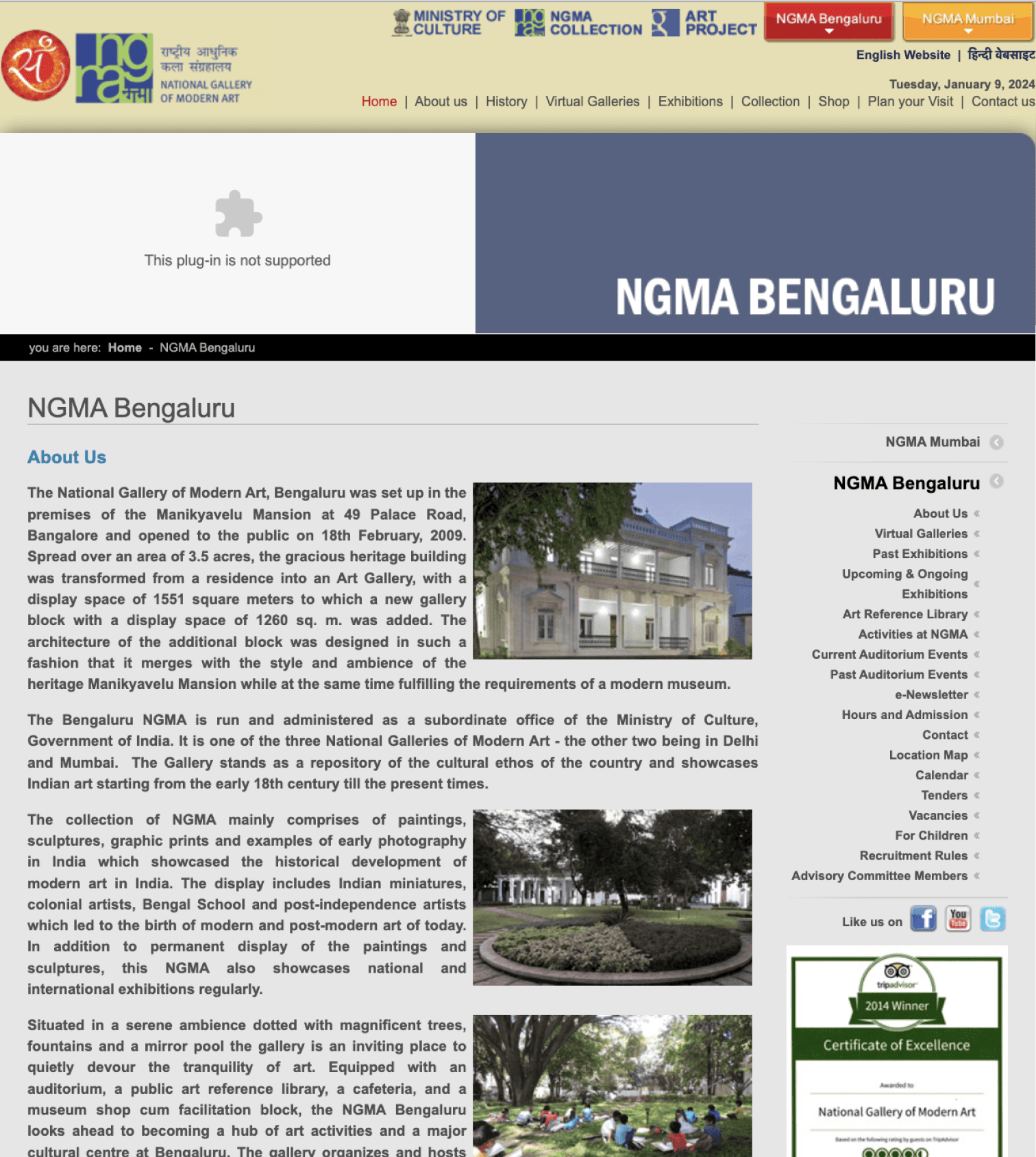


Inadequate information architecture
The information hierarchy is unclear, making it challenging for users to find relevant information about exhibits, events, and resources.
Navigation
Clunky, sub-menus for key sections
Clear, intuitive layout, easy access
Modernize layout, streamline navigation
Information Architecture
Difficult to find, academic language
Well-organized, concise descriptions
Improve information presentation,
use clearer language
Visual Design
Static image, dated layout
Modern, dynamic design,
engaging visuals
Redesign with modern aesthetics,
utilize high-quality visuals
Event Clarity
Cryptic descriptions, jargon-filled
Clear, concise descriptions,
highlight key details
Use simpler language, key focus
on audience engagement
Sharing Functionality
No one-click sharing
Seamless social media integration
Implement one-click sharing with
pre-populated details
Interactive Elements
Limited calendar
Interactive map, virtual tours,
online ticketing
Develop interactive elements,
enhance user engagement
First Impression
Uninviting, old-fashioned
Positive, modern, user-friendly
Improve visual appeal, create a welcoming atmosphere
User Engagement
Frustrating, confusing
Easy to navigate,
encourages exploration
Prioritize user-friendliness, offer engaging content
Accessibility
Complex navigation,
academic language
Clear information, multiple languages,
assistive technologies
Improve accessibility for all audiences
Feature
NGMA Bangalore
MAP Bangalore
Recommendations
for NGMA
Understanding Our Audience
User Journeys and Goals
Demographics and Psychographics
Accessibility and Inclusivity
Preferences and Consumption Habits
Competitive Analysis
As a UX designer, understanding our audience is the cornerstone of crafting a museum website that truly resonates. This isn't just about demographics and data; it's about weaving a guide book of needs, wants, and motivations that breathe life into our user personas.
This is just the beginning of our audience odyssey. We must constantly listen, learn, and iterate, ensuring the website evolves alongside our visitors' needs and desires. Remember, a museum website isn't just about showcasing exhibits; it's about building a vibrant community of curious minds, where every click opens a door to wonder and knowledge.
This body text lays a foundation for your UX case study, emphasizing the importance of audience understanding through persona development and a focus on user needs and experiences. Feel free to tailor it further by adding specific details about your museum, target audience segments, and research findings.






Components
Style Guide
Garamond
Regular
Medium
Semi-Bold
Inter
Light
Regular
Medium
Typography
Colors
Words
that
guide
Writing

Voice & Tone
A
c
b
d
The quick brown fox jumps over the lazy dog.
The quick brown fox jumps over the lazy dog.
#132A97
Klein
Blue
Harvest
Gold
#FFB41E
#F7F7F2
Powder
White
Night
Black
#121212
#222426
Charcoal
Grey
Indian
Red
Indian
Red
#CA6153
Castleton Green
#12644A
Our approach to rewriting the UX copy for the NGMA Bangalore website is centered on enhancing user engagement and facilitating an enriched exploration of the museum's offerings. By crafting clear, concise, and inviting language, we aim to guide users seamlessly through the website, ensuring that information about the art collection, exhibitions, and educational programs is not only easily accessible but also presented in an engaging manner.

This improved UX copy is designed to empower users, fostering a more enjoyable and informative online experience as they delve into the world of art and culture curated by NGMA Bangalore.

Educational Program Highlights
Our refined copy highlights museum educational programs, workshops, and events, ensuring users are well-informed about enriching experiences.
Interactive and Informative Copy
We've paired interactive elements with engaging copy, motivating users to actively participate online, be it exploring virtual exhibitions or learning about featured artists.
Engaging Headlines
We've crafted captivating headlines to intrigue users, inviting them to explore the museum's diverse offerings with curiosity and excitement.


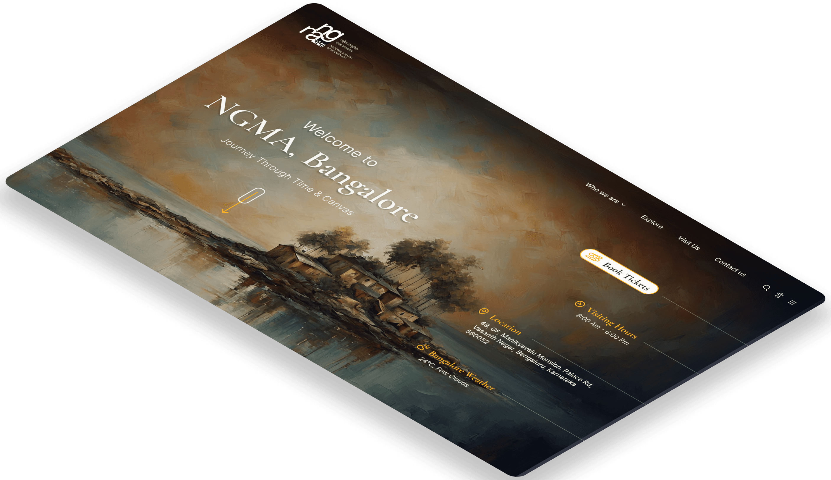
Book Tickets

Bangalore Weather
24°C, Few Clouds
Journey Through Time & Canvas
NGMA, Bangalore
Welcome to
राष्ट्रीय आधुनिक कला संग्रहालय
National Gallery
of Modern art
Who we are
Explore
Visit Us
Contact us



Concept & Theme
The copy concept aims for an immersive online journey, guiding users through NGMA Bangalore's cultural richness with clarity and engagement. The theme promotes inclusivity, inviting active exploration of the vibrant world of art and culture.
Footer
Careers
e-Newsletter
Socials
Tenders
Press
Search
Accessibility
Home
Overview
Featured projects
Artist Spotlight
Exhibitions
(1800s-Present)
App Promotion
About Us
About the Museum
History and Mission
Meet the team
Careers
Governance
Explore
Exhibitions
Events & Programs
Collection/ Parikraman
App Promotion
Visit Us
Address & Map
Visiting Hours
Tickets
Calendar
FAQs
Contact Us
Information Architecture
03
Ideation
Motivation
Loves to find places he can explore on weekends.
Usually finds something new to try.
Likes to learn new things and meet new people.
NEEDS
Find the details of the events happening around him.
Able to share the information with his friends and family.
Quickly Navigate the website for other information.

Aman
“I adore exploring new locations, especially museums and workshops that offer unique experiences. Engaging with art and actively participating in creative endeavors captivates me.”
Frustration
Have a hard time to find events online on time and sharing with others.
Not sure how to reach the location.
Not able to find exact details of the exhibition.
PREFERRED CHANNELS
Website
Social Media
Friends & Family
Guerrilla Efforts & PR
Traditional Ads
User Persona
AGE
26
OCCUPATION
Ph.D Student
INCOME
Approx. Rs 70k
LOCATION
Bangalore, India
ABOUT
Aman is a graduate student at NIFT who cares deeply about animal rights. He is vegetarian and spares his own time by exploring places in his area. He usually likes live events and workshops happening in the city.
Navigating the website
Exploring Events
Planning a Visit
Stage
Steps
Thoughts
Product Touchpoint
Emotions
Sharing info with others
Reflection of a Lost Explorer
Aman is planning to visit a nearby museum. He wants to know more about any exhibitions/ workshops happening on a specific day. He wants to in share info with his friends.
Opens NGMA Bengaluru website, greeted by a static image and dated layout - Searches for "events" through
clunky navigation
Aman searches for nearby museums online.
Stumbles upon NGMA Bangaluru website.
“I wonder what exhibitions or workshops are on?”
Neutral
Excited
Unsure
Frustrated
Dejected
Homepage
Suggest enhancing the website's security to make it more trustworthy at first sight.
Home page clear event links - Reorganize navigation for intuitive access to key sections
Offer customizable message templates for different platforms - Ensure accurate data transfer to avoid garbled information
Enhanced Website and user Experience
Event section pages
Upcoming events and Location page
Event page, social media icons
Online Platforms and museum staff
Curious about museum website or event listing platform.
Not able to find any accurate information.
feels happy about the possibility of finding an event listing.
The experience could've been improved if the website had been working correctly.
What's the fastest way to share this with my friends?
“Where can I find details about upcoming events?”
"Is this calendar from last year? Where's today's event?"
"This map is a relic! How am I supposed to find anything?"
“How do I quickly send this to my friends?”
“I wish it was easier to get all this information.”
"Nice picture, but where's the actual info? This feels like a time warp."
Stumbles upon the event calendar, hidden in a sub-menu under "Activities".
Reads event descriptions filled with academic jargon and cryptic dates
Opens the museum map, finds it outdated with no event locations marked
Tries to copy and paste event details to share with friends, ends up with a mess of text and symbols.
Aman searches for museum location. Aman visits the museum based on the info found on other sources and from museum staff.
improvement/Recommendation
😩
😃
😐
🤔
Enhance event descriptions with clear, concise information
😕
User Journey Mapping
02
User Insight

& Prototype


Visual Designs
MVP Features
Clear Booking System
Intuitive Navigation
Prominent Exhibition Highlights
Engaging Event Promotions
Social Sharing Integration
Accessibility Features
04
Design
Wireframes

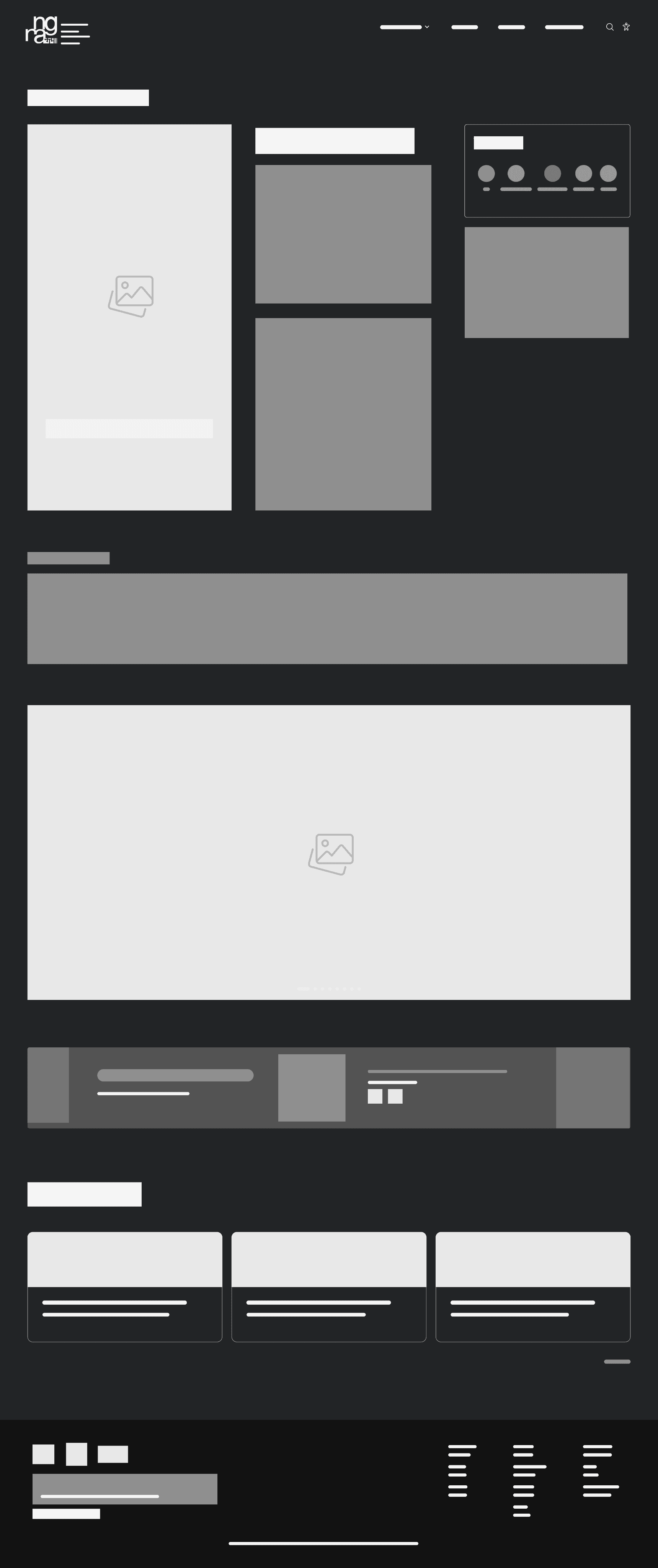


Crafting wireframes for NGMA's new website involves meticulous planning, prioritizing user-centric design and intuitive navigation. These blueprints ensure a seamless and engaging experience, balancing simplicity with sophistication for a visually compelling and user-friendly platform.
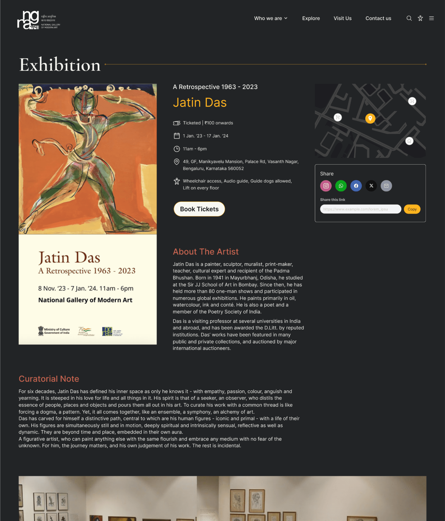


Accessibility Features
Upfront accessibility options for a user-friendly experience through organisations like UserWay.
Social Sharing Integration
Universal share option for all events, promoting user engagement through seamless sharing on social media platforms
Prominent Exhibition Highlights
Streamlined Ticketing
Highlighting key exhibitions with immersive visuals and detailed information for a captivating user experience.
Simplified ticketing system with clear categorization for virtual and in-person events, ensuring a seamless booking process
Comprehensive details for each exhibition, including artist information, themes, and relevant background, enhancing user understanding.
Prototype
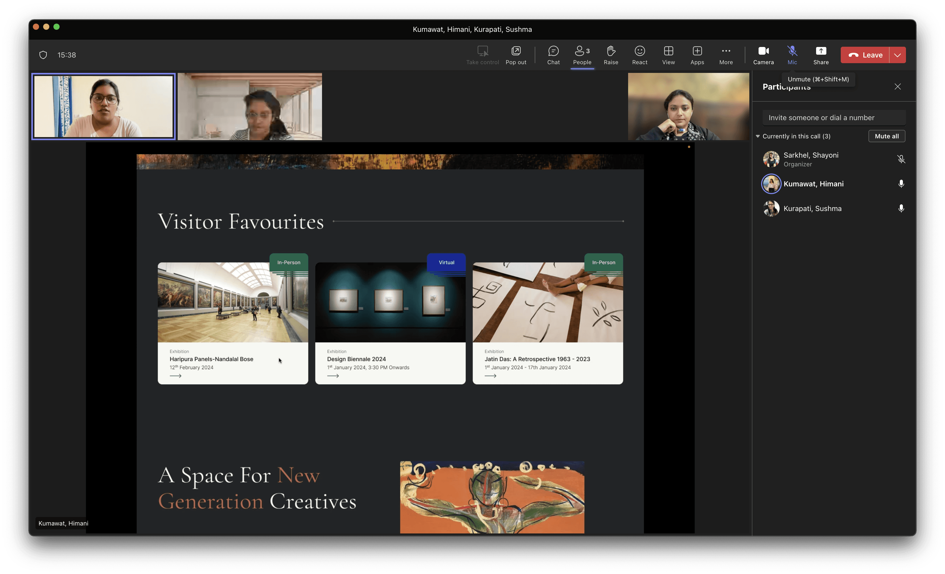
Prototyping each frame for the new NGMA designs involved dynamic representations of the user interface, showcasing the flow and interaction of the website. By meticulously detailing each frame, we ensure a seamless and visually compelling journey for users, aligning the prototype closely with NGMA's vision for an enriched online art and culture experience.

User Testing
As we approach the conclusion of the NGMA website project, user testing becomes a pivotal phase. This process involves engaging real users to interact with the platform, providing valuable insights into usability, navigation, and overall user experience. The feedback obtained during user testing will guide our final refinements, ensuring that the NGMA website not only meets but exceeds user expectations, delivering a truly immersive and satisfying cultural exploration.
The utilization of heat maps during user testing proved instrumental in gaining deeper insights into user behavior and interaction patterns on the NGMA website. By visually representing where users concentrated their attention, we identified hotspots and areas of interest. This data-driven approach informed strategic design adjustments, ensuring a more intuitive and user-friendly experience by prioritizing elements that resonated most with our audience.




05
Test